HyperPlan
Have you ever used a pivot table in Excel, and thought that there must be a better way?
Have you ever built a Kanban board in Trello but realised you need a second axis?
Have you ever designed a table in OmniGraffle or PowerPoint and thought there must a more straightforward way?
I have. So I purchased a license for the Home version of HyperPlan.
My Uses to Date
I’ve owned HyperPlan for just a couple of weeks. Already I’ve found a couple of great uses for it:
- I’ve built an insightful Kanban status board for my projects.
- I’ve used it in a workshop I facilitated. Initially I captured ideas arising from a brainstorming session. Then we went back through each captured thought and allocated them into groups of categories simply by dragging and dropping. I was doing this by projecting the HyperPlan board onto a big screen. It created a great interactive environment.
Features
A nice feature of HyperPlan is that it can track multiple properties for each record. You can use any of these properties to act as the x and y vertices of the pivot table constructed, but the chosen property can be changed at any time with the click of a mouse.
What’s more, any of the other properties can be displayed on the record card itself, or used to build a colour-coding system.
Data can be displayed in three main ways: as a graphical pivot table, as a graph of data, or in tabular form. The pivot table is home base. New data can be added to any element at any time.
The following two images provide an insight into how HyperPlan can build up some detailed insights:
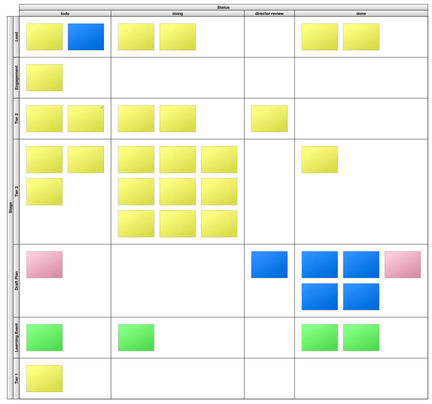 HyperPlan Kanban Board (text on cards has been redacted)
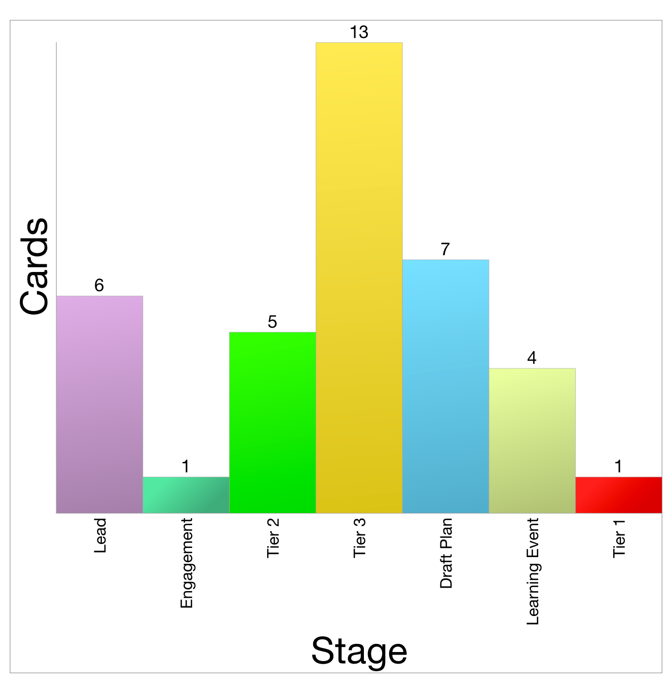 HyperPlan Chart counting categories
Joyful Software
I remain a fan of locally-installed software, over web applications that run in a browser. That probably positions me firmly in the ‘old man’ camp. I don’t care. I like leveraging the power of multicore processors running at multiple Gigahertz. I like the app being in its own container - not a browser. So I commend HyperPlan for being a local app.
Unfortunately, for this Mac user, it’s not quite a native app. There are some giveaways in the user interface and user experience that betray its development with a cross-platform environment. It’s still better than Electron apps, though. These criticisms are little quibbles, like the text alignment of labels not quite matching with the interface controls, and some non-native iconography.
I’ve reached out to the developer, Andy Brice, about these, and he has been extremely responsive. Buying this software also supports a nice person like this. That’s nicer than paying money to a corporate behemoth, or underwriting a valuation for some venture capitalist.
My Recommendation
Ultimately, HyperPlan is fun to use. It’s joyful to see cards whizz around the screen as the pivot parameters are changed. It provides a great visual insight into the dataset in use. I love it. I recommend it.