How good does this look? @vincent @hemisphericviews

How good does this look? @vincent @hemisphericviews

Oh no. I’ve got a bung eye. 👁💥
The Neuroscience of Busyness - Study Hacks - Cal Newport:
You want more out of your employees? Radically reduce their responsibilities, then leave them alone to execute. You want your small business to grow? Focus your attention on a single target, and give yourself the space to do it better.
This sounds right to me.
What happened to all the Milton Friedman acolytes? The business lobby has fretted for years about national indebtedness. Now it’s not an issue. I’ve always been a Keynesian so it makes sense to me, but where’s the backbone of those that argued tooth and nail for austerity for such a long time?
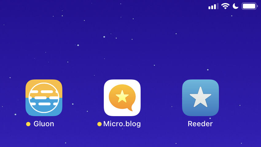
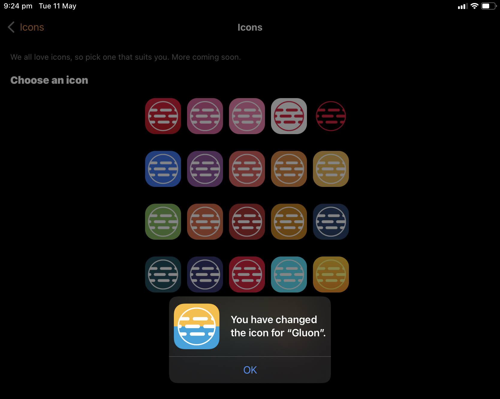
It’s cool when you see your podcast’s colour scheme specifically made available in an app. Thanks @vincent - Gluon is the best!

Does anyone know where I can get a decent icon file of a MacBook Air (Space Grey)? I want to replace the hard disk icon of Macintosh HD.
I’ve finally been able to get rid of the stupid mechanical disk icon. My Macs don’t even have those sort of hard drives. Now I have nice icons that represent the computer I’m using.
Source: Quick Tip: High quality Mac icons are coming from inside your Mac! – Six Colors
The new Gluon app icons are amazing @vincent 🔥🔥🔥
This weekend’s obsession has been SkedPal - notably the beta 3 version. It takes over from the previous weekend’s router analysis and before that, Craft. Special interests and links with autism. 🤔
SkedPal - the smart calendar app that schedules your to-do’s:
Do you thrive on schedules and action plans? Tell SkedPal the things you want to do and advanced algorithms will build a smart schedule for you.
I’m digging into this planning software, despite the 🚨 around some elements. Those concerns, namely being:
Despite all of these misgivings, I am enjoying using it to schedule my days. It’s value proposition is the way it automatically time-blocks days based on all the task criteria while still taking into account your fixed calendar events.
This is basically the solution I’m looking for. So despite all the misgivings, I might throw my money at the company and see if it works for me.
At least as a paying customer I will apparently get access to the beta 3 software.
A simple bookmarklet to post links to Micro.blog based on the current page in your desktop browser. Supports text selections.Source: Micro.blog Posting Bookmarklet – Colin Devroe
Seems to work a treat. Thanks @cdevroe.
Don’t worry… the regular @hemisphericviews podcast isn’t changing, moving or going away! Our new One Prime Plus membership option is simply a sweetener for those who wish to gain extra content and show support for their favourite podcast and its hosts @martinfeld, @Burk and I.
Pledge your support directly from our Patreon site.
My wife has presented her maiden speech to the Parliament of Western Australia, as the Member for Victoria Park.
It was an honour to be in the public gallery to watch her deliver this speech. It’s been a long journey, but the reward makes it all worthwhile!
I have such a blast recording @HemisphericViews with @martinfeld and @Burk. A consistent highlight of my fortnight.
Resistance was futile… iPad Pro.
I’m loving my new Asus ZenWifi mesh devices. Way faster than my old Google Wifi. It took an entire weekend of research and a lengthy Craft document with input from @Burk but I’m sure it has paid off. My internet is now the best it can be.
As an update to my last post I’ve stress tested my wifi signal and I feel relieved. My crappy router is still crappy and a mesh network is necessary. Money not wasted.
My entire internet stack is being rebuilt. I changed ISP. The new ISPs connection uses a different protocol which wasn’t working with my Google Wifi, so I’ve temporarily reverted to my modem/router which has been in bridge-only mode for the past 3 years.
Now my wifi is faster than it has been in ages. Problem is, I don’t know whether it’s the new ISP or the removal of Google Wifi. So much for A/B testing. I do know that the last few firmware updates for Google wifi have been reported as being terrible for impacting overall speeds.Last night, before this change and after a weekend of research, I ordered the Asus ZenWifi XT8 to replace the Google devices.
So Google Wifi was always going in the bin, but now I don’t know whether I’ve set fire to a bunch of 💵 by buying the Asus, when I may have been able to keep the household running on my clunky D-Link DVA-2800 DSL modem/router.
Isn’t hobbyist computing fun?
So with all my wifi research, I haven’t bought any new hardware, but I have signed up to a new ISP. 🤷🏼♂️
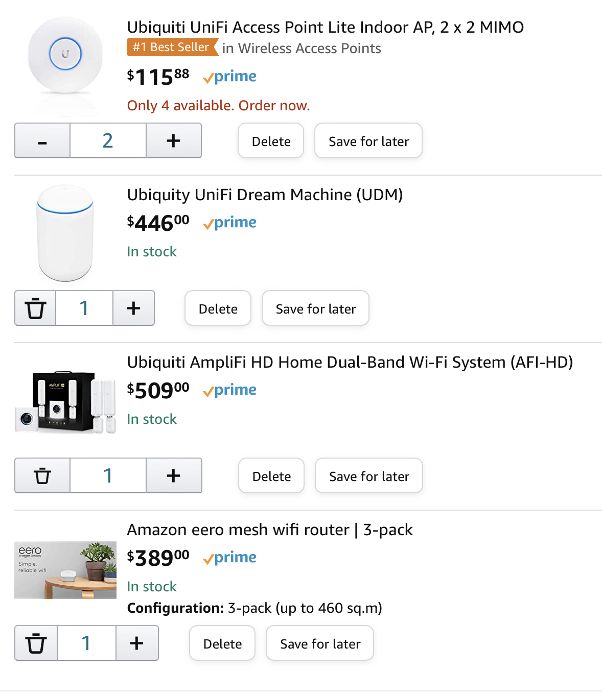
Wifi Options…

I’m losing confidence in my Google wifi mesh setup. Is Eero any better? If I spend on a network upgrade I’d like for it to be appreciably better.