Is this the best subscription cancellation deal ever?
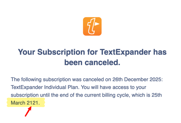
Is this the best subscription cancellation deal ever?

Tuesday, October 28, 2025
The following article is predominantly a record for my future self. The solution as described was imagined and thought through by me, but development was helped by ChatGPT because I don’t have the necessary coding skills. As it took a long time with multiple iterations, I asked ChatGPT to summarise and document the flow of my attempts.
As such, the majority of this article is AI-generated, but proofread and edited by me, a human.
For years, I’ve kept OmniFocus as my single source of truth for tasks. Every commitment lives there — work projects, household jobs, even odd ideas that might grow into something.
But my work notes live in Obsidian. That’s where meeting records, brainstorms, and running logs of ideas go. The two systems complement each other perfectly — except when they don’t talk.
I wanted a way to extract the tasks I jot into Obsidian (- [ ] Do the thing) and have them appear automatically in my OmniFocus inbox. No manual copy-and-paste. No Quick Entry window. No duplicative reliance on the Tasks plugin for Obsidian. Just seamless capture.
In short, bridge the gap between where ideas start (Obsidian) and where they’re managed (OmniFocus).
I thought this would be quick and easy. It definitely wasn’t quick.
OmniFocus supports AppleScript. The theory was to have a script read tasks from the note, feed them to OmniFocus, and be done.
It didn’t go well.
AppleScript threw up errors like:
“Expected end of line but found plural class name.”
Keyboard Maestro tried to help, but AppleScript didn’t behave the same when triggered from automation tools. Even when it ran, nothing actually appeared in the Inbox. After several dead ends, I concluded AppleScript might be powerful — but it’s also brittle, opaque, and slow to debug.
That led me to OmniFocus’s x-callback-url API. This allows new tasks to be created via a simple URL such as:
omnifocus://x-callback-url/add?name=Test¬e=Hello&autosave=true
The autosave=true parameter was the key. It bypasses Quick Entry completely and saves the task directly into the Inbox.
That was exactly what I wanted: a silent, background handoff.
My first working prototype ran from LaunchBar.
I created an action that triggered a shell script, which in turn parsed the current Obsidian file and sent the tasks via the OmniFocus URL scheme.
At first, it looked promising. LaunchBar picked up the script, presented it as an action, and I could trigger it with a simple keyword. But then the gremlins arrived:
“The script does not implement a handler named 'run'”.After hours of troubleshooting, I realised the reliability wasn’t there. The script itself worked — but LaunchBar wasn’t the right launcher.
I rebuilt the automation inside Keyboard Maestro, which handles timing, focus changes, and system permissions much more predictably.
The macro:
Everything was almost perfect — except nothing happened. The logs said “No open tasks found.”
After several tests, I discovered the real culprit: macOS’s ancient Bash 3.2, which lacks mapfile. My whole parser depended on that command, so the script never captured anything.
The fix was to make it Bash-3.2-safe. The parsing logic was recreated in Perl, which handles UTF-8 and regex. Instead of mapfile, it outputs each task line to a temporary file and loops through them safely.
/usr/bin/perl -ne 'if (/^\s*[-*]\s*\[\s\]\s+(.+?)\s*$/){print "$1\n"}' "$FOUND" > "$TITLES_FILE"
Each task line is then URL-encoded and sent directly to OmniFocus:
open "omnifocus://x-callback-url/add?name=${NAME}¬e=${NOTE}&tags=Obsidian&autosave=true"
No Quick Entry panel, no intermediate prompts — direct to the Inbox.
The final piece was Alfred. After LaunchBar’s unreliability, I moved the trigger there. Alfred handled it flawlessly.
Now I just type cap in Alfred (for , and it fires the Keyboard Maestro macro that runs the script. Within a second, all unchecked tasks from my current Obsidian note appear in OmniFocus, tagged “Obsidian” with a backlink to the note.
 No friction, no crashes, and no mysterious “handler” errors.
When the first test task appeared silently in my OmniFocus Inbox, I felt great satisfaction and relief. After all the false starts — AppleScript’s syntax chaos, Bash’s 2007 limitations, and LaunchBar’s quiet failures — it finally worked.
That single, silent task represented a perfect workflow: low friction, invisible automation, total reliability.
mapfile or other modern features.capIt’s simple, fast, and utterly reliable — everything good automation should be.
When people talk about “seamless capture” in GTD, this is what they mean. The tools fade away, leaving nothing but flow. Now, if only I could have this work on Windows…
Monday, December 9, 2024
Norwegians are the best. Listeners of Hemispheric Views will already know of the esteem in which I hold fürstenberg; who is essentially Norwegian me. We have many similarities across our respective histories; it’s quite fun!
Now, I’ve got another Norwegian to thank: Erland. I discovered Erland through Mastodon, I think. Although he also has a micro.blog site, so it could have been there. Like myself, Erland also seems to have an interest in notetaking apps, and his favourite is Paper. He wrote a wonderful review of it.
I’ve looked at Paper in the past, but the sheer cost of the app prevented me from trying it. I have so many Markdown notetaking apps, I simply couldn’t justify buying another, no matter how nice it may be.
Now, though, thanks to the kindness of Erland from Norway, I am typing this blog post in Paper, as a way of testing. I’m using the Mac app now, but I also have the iOS version. How? Erland provided me with codes for the apps! This came about as we had a little discussion on Mastodon (still my favourite social network) about our notetaking app preferences. Typewriter mode was one such nicety, and I see that Paper offers that very feature. I have enabled it now, and it is very lovely—especially the slightly delayed scroll on each carriage return.
This blog post is the first thing I’ve written in Paper. I’m about to go back and add links and stuff. I’m using my new MacBook Pro which is lovely, but I haven’t yet installed Brett Terpstra’s SearchLink tool to automate link insertion, so we will see how Paper handles this next process.
The takeaway from this blog post? Firstly, Paper is a new app I’m trying. The main point though? Norwegians are great! I must visit sometime.
Sunday, December 3, 2023
Once again, I’m here to blog about my favourite Mac Apps for the year.
See previously:
For my purposes, to be considered an App of the Year, the software needs to be something I used extensively, value and enjoy. I also must feel I would miss them if they suddenly went away. Of course, it also needs to be a Mac App.
It’s almost to the point where this app needs to be put into the Hall of Fame, and removed from future consideration. OmniFocus continues to provide structure to my life both at a professional and personal level.
Most of this year has been spent using the beta of OmniFocus 4 in tandem with OmniFocus 3. The new version has come a long way and is closing in on release.
While there are elements that continue to frustrate me (please, can we have natural language entry?) there is still no other task manager that can filter, slice and dice tasks like OmniFocus. And of course, defer dates. No task manager can be serious if it doesn’t have the ability to set a start date for a task into the future.
Notes apps are my playground. I bounce between them continuously. Heck, I’m writing this post in iA Writer! This year, however, has seen me give Obsidian another try - after I stuck with Logseq for some time before it.
There are parts of it that I still don’t like, but it’s now rock solid, and the price cannot be beat. I am even putting aside the fact that it is running in Electron! 😱
I wanted to continue to use Agenda, but it’s simply too fiddly. Plain text entry is so straightforward, it is hard to beat.
2023 was the downfall of Twitter. In its place stormed Mastodon and I have enjoyed using Mona. While most of the cool kids seemed to gravitate to Ivory, for me Mona ticks all the boxes I need from a Mastodon client.
Last year, NetNewsWire took over from Reeder as my RSS app of choice. This year, I’ve flipped back to Reeder across macOS and i(Pad)OS. It’s smooth and gorgeous, and rock solid.
What’s even better is that this year has seen somewhat of a renaissance in blogging, and with the help of the App Defaults craze, launched by our own Hemispheric Views 097, I’ve found a bunch of new voices to add to my feed reader.
Last year I used Arc. For whatever reason, this year I’ve retreated to the comfort, energy efficiency, and cross-platform syncing offered by Safari. It also makes me feel good that I’m not supporting the Chromium hegemony.
Thursday, July 6, 2023
I can’t believe that 40 years of computer software design has led us to a world where we are all reliant on a range of entirely bespoke browser-based apps. The tech world has really ended up in a basket-case of UI design.
I don’t mind server-based stuff, but I love a native front-end. It’s such a shame that market economics has resulted in us running complex apps in an app that was never designed for that purpose. It’s such a massive kludge, retrofitting entire platforms into a web browser.
Native code kits are sitting right there, and simply not being used.
It saddens me.
Friday, June 9, 2023
Social Media Deathwatch II - Mark writes:
When a site tells you they don’t want you using it, except by their captured clients, you should stop using it. All they want is to control you and put ads in your eyeballs, until you explode.
…
Reddit came out of Digg being fed into a woodchipper just because Kevin Rose wanted a little bit of money…
Don’t use closed networks owned by someone else.
The enshittification of Reddit is now complete.
Christian Selig, developer of the best Reddit client, Apollo, is shutting it down after he failed to comply with Reddit’s mafia-style multi-million dollar shakedown effort. Instead of paying the protection money, he is closing Apollo down.
Remember all those cool tips about adding reddit to the end of your search term to find real results? That’s probably not going to be reliable much longer, because I think this is the first—and last—step to Reddit becoming an unmoderated cess pool of spam, devoid of helpful humans contributing good content.
This is a cycle that any venture capital-backed firm seems unable to fight against. The interest of community and users is sacrificed at the altar of money; those high priests seemingly unable to see that it is the community being sacrificed that generates the potential to make money in the first place.
I’ve enjoyed Reddit. Maybe we need to reboot Usenet?
Tuesday, December 13, 2022
How good is the Mac indie developer community?
I have been a long-time user of the SearchLink service developed by Brett Terpstra. I use it so regularly that I have it tied to a button on my Stream Deck, as well as keyboard shortcut, ⌃ + ⌘ + L.
Last night I attempted to use SearchLink while typing in the all new MarsEdit 5. Instead of it working as it always has, I received a confounding error:
The action “Run Shell Script” encountered an error: “-e:1778:in `scan': invalid byte sequence in UTF-8 (ArgumentError)
from -e:1778:in `ddg'
from -e:987:in `parse'
from -e:2147:in `<main>'”
This was beyond me. I knew that MarsEdit 5 had a new foundational text editing platform, so I assumed whatever had changed was probably a bug related to that. I also tried SearchLink in BBEdit (another great Mac app made by legendary Mac developers, Bare Bones Software) and the problem appeared there too - which shot somewhat of a hole in my MarsEdit theory.
Nevertheless, I emailed Daniel Jalkut, developer of MarsEdit, with a support request. He quickly responded saying that he doesn’t use SearchLink, but would look into it.
I also sent a support request to Brett. Very quickly Brett asked a further diagonostic question, then while I was asleep (welcome to Australia-USA relations), he emailed me through an updated version of the SearchLink script. Brett had determined that DuckDuckGo, the engine powering SearchLink, was suddenly providing results in a zipped format. The new version 2.2.27 fixes the issue.
So within hours of noticing a problem with SearchLink, I again have a working version that supports the all-new MarsEdit 5 — and every other Mac-assed Mac app1 that works with services2.
The Mac indie developer community is amazing. I thank them, and encourage you to support them by buying and using their products. Let’s keep this thing alive.
Kudos to you, 1Password, for registering the domain macassedmac.app in defense of Electron-based 1Password 8. I don’t know what to think. ↩︎
I’m looking at you, Electron. ↩︎
Monday, May 16, 2022
I’ve been a long-time user of Drafts, but my subscription is due to expire next month and I have been thinking that I’d let it go. I’ve been using Tot more these days, and Drafts had become an intimidating mess that I didn’t enjoy using.
However, after listening to a Mac Power Users podcast featuring the Drafts app and an interview with its developer, and then reading a blog post by Jason Burk about his Drafts setup (plus a personal conversation with him), I realised that it wasn’t necessarily Drafts that was the problem - it was what I had done to it.
That’s the thing, Drafts is almost endlessly customisable to enable it to fit different users and use cases. I had created so many Actions, Action Groups, and sections that the app had become confusing and overwhelming. I had duplicated actions across different groups, I was having to think too much whenever I wanted to use the app.
As I said to Jason, actual use beats good intentions. My Drafts configuration had become so bloated with convoluted actions that I thought I might use someday that it put me off from using the simple actions I will actually use today.
I’ve taken my myriad Action Groups and boiled them down to a single set. Now the only Actions that confront me are the ones I am likely to use and I don’t need to think about switching between different Action Groups.
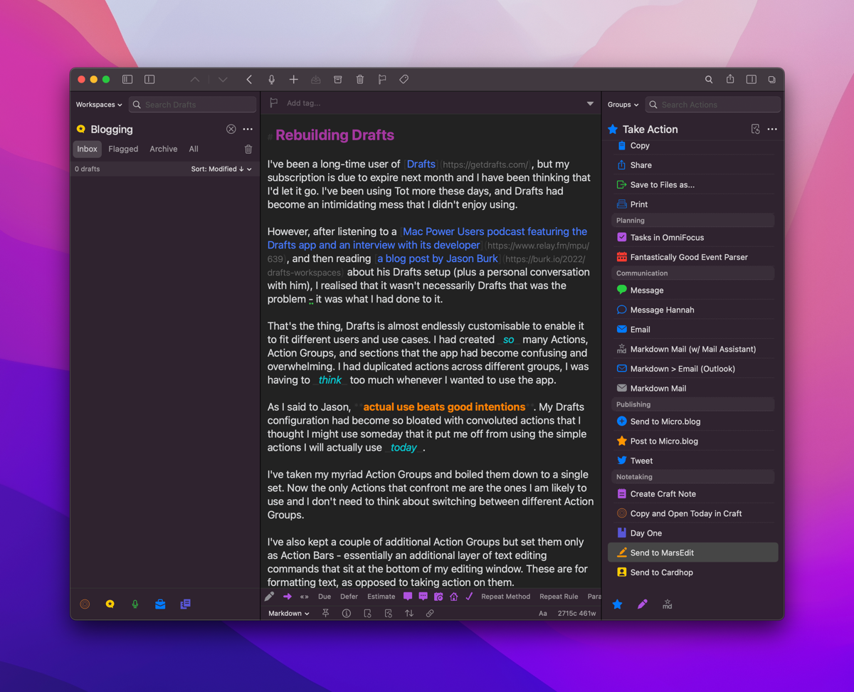
I’ve also kept a couple of additional Action Groups but set them only as Action Bars - essentially an additional layer of text editing commands that sit at the bottom of my editing window. These are for formatting text, as opposed to taking action on them.
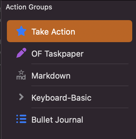
In terms of Workspaces, I’m keeping that as I previously had configured, but have clarified my thinking about them. I have workspaces dedicated to:
These are populated through smart searches based on a tag I apply to each note.
The Templates Workspace is specifically for OmniFocus project templates that I send to OmniFocus using the scripts that Rosemary Orchard created. I continue to use this system because it allows for date math (for example, a task will be deferred 6 months from the date the project is created).
I’m now feeling much more positive about Drafts after this cleanup. The Drafts editor is great, it supports all the Mac niceties (Services, smart markdown link insertion/pastes, etc.) and now I don’t feel overwhelmed when I load the app. Of course, Drafts also offers that great unique selling proposition of a blank field that is ready for text entry immediately. This is especially great on iOS.
Thursday, January 6, 2022
It’s that time of year when many are making lists and undertaking audits of their subscription services.
I had an old list in Dynalist that was almost complete. I’ve updated it and moved it into Craft, where I will attempt to maintain it over time.
Tuesday, December 14, 2021

Update: 14 December 2021:
John, a kind reader of this blog emailed me to correct the record regarding the age of these apps. I imply below that Quicksilver predated Launchbar when in fact Launchbar is the oldest of the crop. In my usage, Quicksilver was the first King - it was my gateway drug to this application category. But Quicksilver was not the first.
A few days ago I noticed that Launchbar was consuming excessive CPU cycles on my iMac. I quit the app and relaunched. Same thing. I rebooted my Mac. Same thing.
That was the straw that broke the camel’s back.
I went to the website of Alfred, downloaded the app and purchased the Powerpack immediately.
After perhaps a decade(?) of daily use I was over Launchbar. For the last few years it had seen very little development. The developer was showing it no love - no blog posts, no forums or user community, and its attempt to copy the Alfred ‘workflows’ feature had fallen flatter than a pancake. Now, I couldn’t even rely on it being an efficient system application.
So I threw my years of muscle memory in the bin, and I’m working with Alfred from this point forward. It’s different - and I’ve had to tweak a few settings to align with my view as to how an app launcher should work - but it’s working. The main adjustment I had to make was to allow for arrow keys to traverse the file structure.
My main frustration is that it doesn’t seem to automatically include files and folders in the default search when the trigger keys are depressed. Instead I have to type a space to enter into file search mode. I see in the preferences that you can include these in the default search, but the app includes text that seems to be warning me off doing that.
It also doesn’t have the instant-send feature of Launchbar. While that was neat, I didn’t use it so often that I desperate miss it. It was a nicety, but I can live without it.
What I can report about Alfred is that it works without fuss. It is currently using 0.2% of CPU time. It lets me search and act on files. It is fast.
Launchbar has been the reigning King since it took crown from Quicksilver. It has now passed the throne to Alfred. Long may it reign.
Tuesday, August 17, 2021

By way of follow-up to yesterday’s review of Tot, I can confirm I’ve bought the iOS version.
Tuesday, August 17, 2021
Update: The day after writing this, I bought the iOS version of Tot.
My friend and Hemispheric Views podcast co-host Martin Feld is Mr. Default. He likes Reminders. He like Mail.app. He likes Calendar. Not for him the world of OmniFocus, MailMate or Fantastical. No sirree. Keep it simple, keep it made by Apple. Except… he uses Tot. I’m sure he uses Notes as well, but Tot. Not Drafts.
I installed Tot on my Mac when it was released, because as with anything made by The Iconfactory, it’s worth a look. I didn’t get it. It offers a 7 note maximum. It has limited Markdown support. Mostly, though, while the macOS app is free as in beer, the iOS version of the same app is AU$30.99. For a tiny notes app? So my exploration of Tot ended, and I went back to Drafts, and DEVONthink, and iA Writer, and Craft, and the list goes on.
Recently, I raised again my frustration with my note and file management “system”. Martin reminded me of Tot. So I’ve been giving it another try. This time, my verdict feels quite different.
The limitations seem useful. The restrictions seem like helpful guiderails rather than annoyances. This all comes at a time when I’ve cancelled my automatic renewal of Drafts - an app I appreciate for its power, but hate because of its interface.
I’ve been using Tot on macOS only over the past few days. At this stage I can’t comment on how it works on iOS because I haven’t spend the money. I think I will, though.
I’ve written this short article in Tot (yellow page). It’s delightful. And, icing on the cake, this is a Mac-Assed Mac app which has full support for all the niceties of macOS, including Services. I love using Brett Terpstra’s SearchLink service. Tot loves using it too. After a week of reading about 1Password ditching native code in favour of Electron, the joy of using a native app is sweeter than usual.
So Tot. Write in it. Put ephemera in it. Switch between plain text with markdown and rich text. Share it somewhere else. You’ve got 7 notes. Use them wisely.
Thursday, July 22, 2021
I want to use and love BBEdit. I bought version 13 with a similar thought and feeling. That purchase seems like it was only a few months ago - in fact, I checked to see if I was eligible for the free upgrade. According to my receipt stored in 1Password, however, my v13 license was acquired on 21 December 2019. Time flies, especially in 2020, the year of our COVID.
I am not a coder. I don’t do any development. I understand the theory of regex and grep but rarely use them. I write an occasional blog article in Markdown, such as this one.
I have a bunch of well-designed Markdown editors that are purpose-built for writing blogs in Markdown. They have grammar-checks and nice management of links, images and feature great preview modes. They feature typewriter mode. As best I can tell, this is still not implemented in BBEdit 14.
But BBEdit is a Mac classic. It can do virtually anything with text (if you know how to drive it). That brings up the real weakness of BBEdit - a lack of support for the new user, and modern tutorials. BareBones, the developers, are old men. They write great documentation1 but offer zero modern promotion and support. The manual is great, but how about a YouTube channel with some tutorials? Where does a beginner start with this application?
The features added to BBEdit 14 seem helpful to developers. That’s not me. Jason Snell demonstrated some clever manipulation that can be achieved to help produce blogs. I don’t know how he did it. He talked about AppleScript, but didn’t provide the code. I presume this trick wouldn’t work out of BBEdit’s box.
Herein lies the problem with BBEdit. It’s great. It’s wonderful. It’s built for people who already use it and know how to use it. However, I would say this to the team at BareBones: if you’re building a software application, perhaps at some point you need to turn an eye to the new users. The ones that might otherwise choose the free Visual Studio Code. The ones who might already use the copy of iA Writer they own, or Drafts, Craft or Ulysses. Users like me?
I want to use BBEdit. But why should I? Perhaps I shouldn’t.
BareBones 14. I’m sure its great. But I can’t know, because I’m not experienced enough to say.
The manual for BBEdit runs over 400 pages.↩︎
Sunday, March 28, 2021
The Archive owes its heritage to nvAlt, which owes its heritage to Notational Velocity — a unique piece of software that broke new ground by integrating new note creation with search in an Omnibar. I’m old enough to remember using the original Notational Velocity. The Archive is true to the heritage of the OG, but moves it in a direction specifically suited to the zettelkasten philosophy of note taking.
What’s zettelkasten, you ask? It’s too much for this software review, but in short it’s a note taking methodology that sees the deconstruction of source material broken down into atomic facts/points, expressed in its own words by the note taker, and given a unique reference link such that it can be tied to other items of knowledge held within the corpus of notes.
A key to the zettelkasten, and thus key to The Archive, is the generation of a Note ID. Upon creation of a new note in The Archive it is given a Note ID which is a concatenation of YEAR MONTH DAY HOUR MINUTE. This ensures that every note can be identified as a unique item, because each note will have a different ID.
To tie these notes together, The Archive supports wiki-links, in the form of [[Note ID or Note Title]]. This makes it possible to create a web of notes, where each atomic note can be tied to others: a key requirement of a zettelkasten.
The app is a good Markdown citizen, and it supports the streaming API to Brett Terpstra’s Marked app. It can also be configured to use an external editor, should you have a preferred one. Given The Archive is quick and efficient, and supports typewriter mode, I don’t bother using an external editor.
The Archive allows you to generate and keep saved searches in a sidebar. This could be useful if you want to show all notes tagged with a particular #hashtag. I use it to break down my notes into years - by relying on the first element of the Note ID, which is the year.
A fun element of The Archive is the range of Keyboard Maestro add-ons that have been built for it. My favourites are the ones that search the notes corpus and allow for quick creation of wiki links. Make sure Keyboard Maestro has full disk access to guarantee some of these work, though.
The user community has built a range of alternative themes so the app is customisable to a point. It also supports multiple text corpuses (corpi?) but only one can be loaded at a single time. A corpus simply represents a folder of text files in the standard filing system, which means The Archive can be complementary to other Markdown/text editors. It doesn’t lock you in. While it doesn’t have an iOS app, the ability to work with files stored on a cloud storage platform means it works nicely with unrelated iOS text editors.
The Archive can be used as a replacement for nvAlt if that’s all you need. It feels more stable than that app. Of course, there is nvUltra in development - but that has had a very long gestation period, whereas The Archive is here and now.
Tuesday, March 2, 2021
I also own 1Writer, which also plugs directly into Dropbox, and is, arguably, a better editor. It’s certainly a more fully-featured one.
Yes, I own many text editors. It’s the curse of the tinkerer.
I also forgot that you can pretend a file name with _ in Blot and it won’t publish it as a live post. I’ve done that with this entry, so ideally it will publish when I’m finished and ready - not when I’m just getting started.
So many different ways to skin this cat.
Tuesday, March 2, 2021
I’ve owned Byword for many years. I think it was the first Markdown editor I bought, for both iOS and macOS. I abandoned it a long time ago as well, as it seemed to pale in comparison with other Markdown editors.
In looking for an easier way to post to Blot via Dropbox, however, Greg Moore suggested Byword.
I’ve installed it here on my iPad, and it does connect neatly to Dropbox - bypassing the futzy iOS Files.app interface.
I’m typing this directly into Byword into my live Blot site. That may not be the ideal workflow - perhaps a non-published draft might be a better option, with the file then dropped in as a finished item. Nevertheless, it’s interesting that a very old tool such as Byword may be the best one for the job.
That job being, making it as easy to publish to my Blot site as it is to publish to my micro.blog. If it’s not easy, I won’t do it. That much I know to be true.
Tuesday, December 29, 2020
I’ve been consciously taking more and better daily notes. Part of this is to build a greater awareness of what I do and how I spend my time. Part of it is to be able to capture and later resurface information.
I’ve tried a number of various solutions to this. I experimented with Bullet Journaling (with a pen and journal) and using the Cortext Podcast’s Theme Journal. However, paper creates too much friction considering that I am usually in front of a screen of some sort and I want digital information in any case. I’ve used a range of software, from GoodNotes with an iPad Pencil, DEVONthink with a script to create a daily note everyday, The Archive, Obsidian, and I even trialled Roam Research for a time.
DEVONthink got the closest in terms of being accessible and leveraging its AI to highlight related notes (a feature that has no peer, to be honest). Yet DEVONthink’s text editing is anaemic. No niceties for drafting in Markdown as is my preference. No outlining, which I enjoy and find productive.
I needed a better solution.
It occurred to me that everything is an outline. Mind map? It’s an outline. Kanban board? It’s an outline. Chapters and paragraph styles? It’s an outline. Diaries and daily notes? It’s an outline.
So if everything at its essence is an outline, why not use an outliner? So here I am, using Dynalist as my everything capture tool. I decided on Dynalist after a short play with Workflowy. Workflowy is simple but has none of the features I wanted such as Markdown, linking etc. It is too basic for my wants.
The great feature of Roam - as well as being an outliner - is that it automatically creates a ‘Daily Note’. This seemingly simple feature reduces the friction of having to create a document, or find a place to put text. Put it in the daily note, at least as a starting point.
This is why I created a script in DEVONthink to create a daily note text file at the beginning of each day.
I wanted to ensure that my Dynalist setup could also have a daily note, but it doesn’t come with this feature.
This is where I give thanks to Steve Zeoli at Welcome to Sherwood. He drew my attention to a simple Windows app that can create a list of dates that cover an entire year.1
I use the date file created from this application to pre-populate a year’s worth of nested bullets for my Daily Note outline.
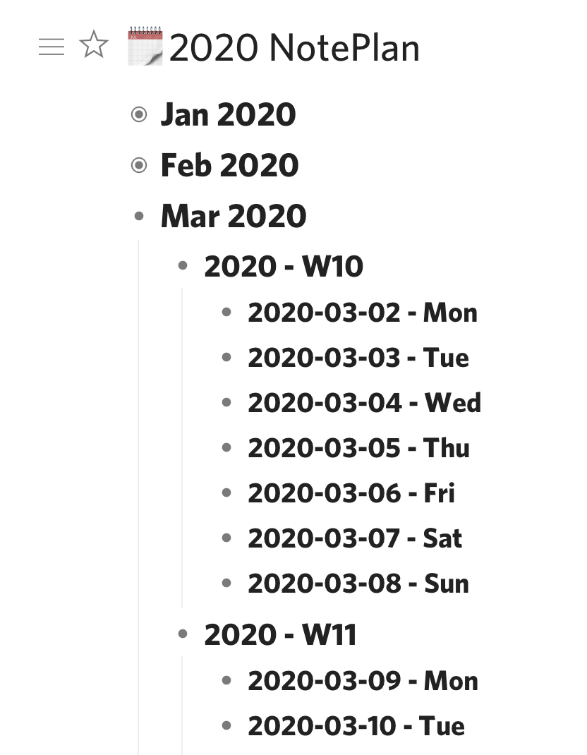 Dynalist Day List
The great thing about Dynalist is that I can ‘zoom in’ (hoist, in old-school outliner lingo) any bullet such that it becomes the header for the page. So I can zoom into a week, or even a single day, and make notes nested under that particular header.
Dynalist supports backlinks and internal Wiki linking, so typing [[ will bring up an active searching letting me link one part of the notebook to another.
It also support dates by starting with an !. I sync these dates to a Google Calendar, which I subscribe to via Fastmail where all my calendars live, to give me another view into my dated tasks from other calendar-based applications such as BusyCal and OmniFocus.
I am still in the process of optimising my search settings, but I’ve devised a couple that seem to work well. Searches can be saved as a bookmark within Dynalist and they run when click on in the sidebar.
has:checkbox -is:completedwithin:1mI’ve drafted this blog entry in Dynalist (with a couple of detours into Drafts to make use of Brett Terpra’s SearchLink service to create Markdown links). The lack of macOS Services support is one big downer with Dynalist.
The intent now is to export it as a Markdown file and publish it to the world.
Unfortunately, getting nice Markdown out of Dynalist wasn’t perfect. Exporting as plain text with dashes for indentation was the best I could do. This didn’t establish H1, H2 headings and nor did it ensure my graphic was exported. Each paragraph was adorned with a bullet, which doesn’t make sense for long-form writing, either.
It would appear others feel this pain too, as there are a number of threads about it on the Dynalist forum; with this one summing it up best.
So export to markdown is an area that needs some work. Perhaps it isn’t optimal for writing pure blog posts, leaving a place for iA Writer in my arsenal.
I did figure a way to do this on macOS as well, but I can’t remember how I did it! I should have taken a note!↩︎
Monday, February 17, 2020
Have you ever used a pivot table in Excel, and thought that there must be a better way?
Have you ever built a Kanban board in Trello but realised you need a second axis?
Have you ever designed a table in OmniGraffle or PowerPoint and thought there must a more straightforward way?
I have. So I purchased a license for the Home version of HyperPlan.
I’ve owned HyperPlan for just a couple of weeks. Already I’ve found a couple of great uses for it:
A nice feature of HyperPlan is that it can track multiple properties for each record. You can use any of these properties to act as the x and y vertices of the pivot table constructed, but the chosen property can be changed at any time with the click of a mouse.
What’s more, any of the other properties can be displayed on the record card itself, or used to build a colour-coding system.
Data can be displayed in three main ways: as a graphical pivot table, as a graph of data, or in tabular form. The pivot table is home base. New data can be added to any element at any time.
The following two images provide an insight into how HyperPlan can build up some detailed insights:
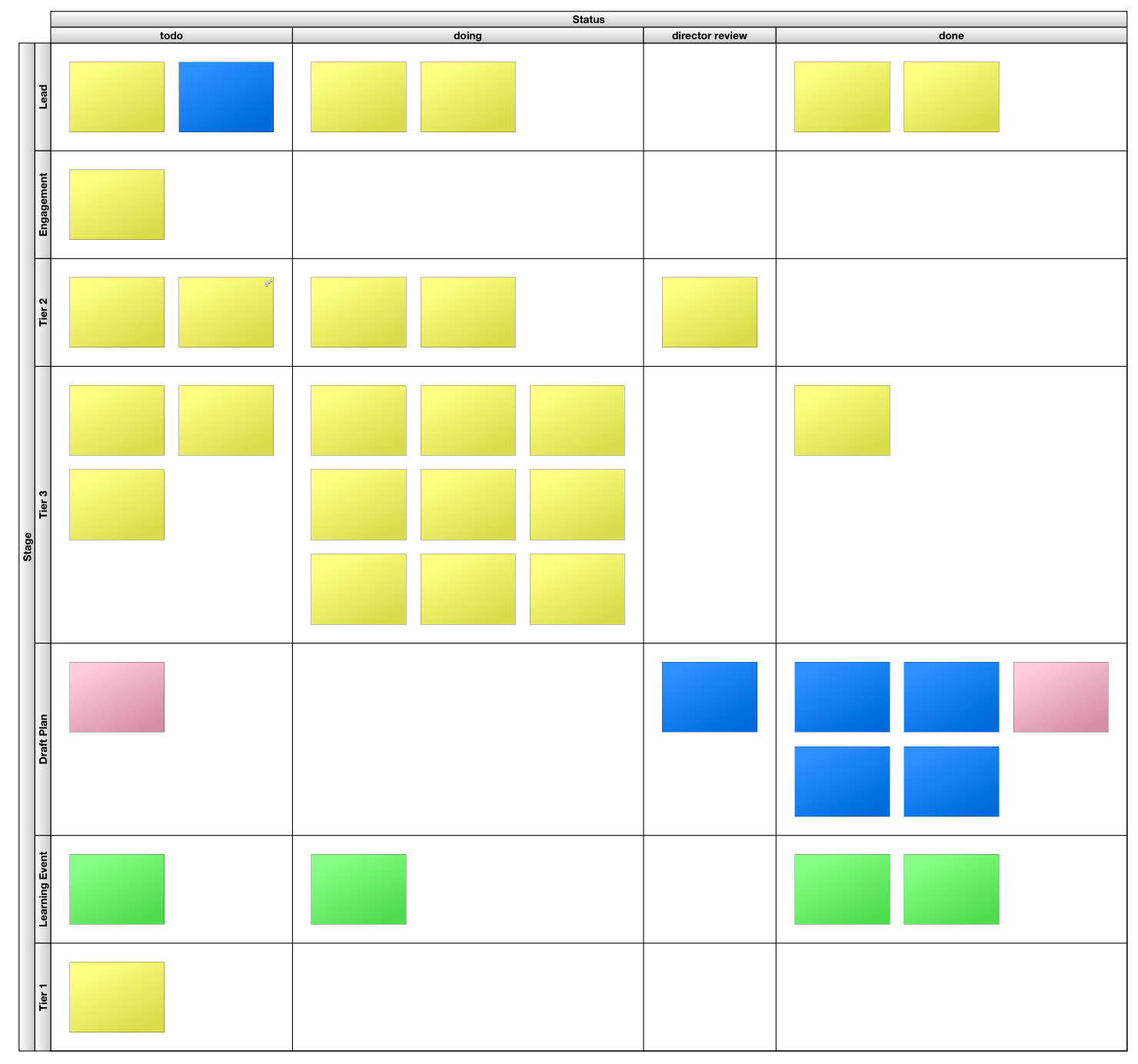 HyperPlan Kanban Board (text on cards has been redacted)
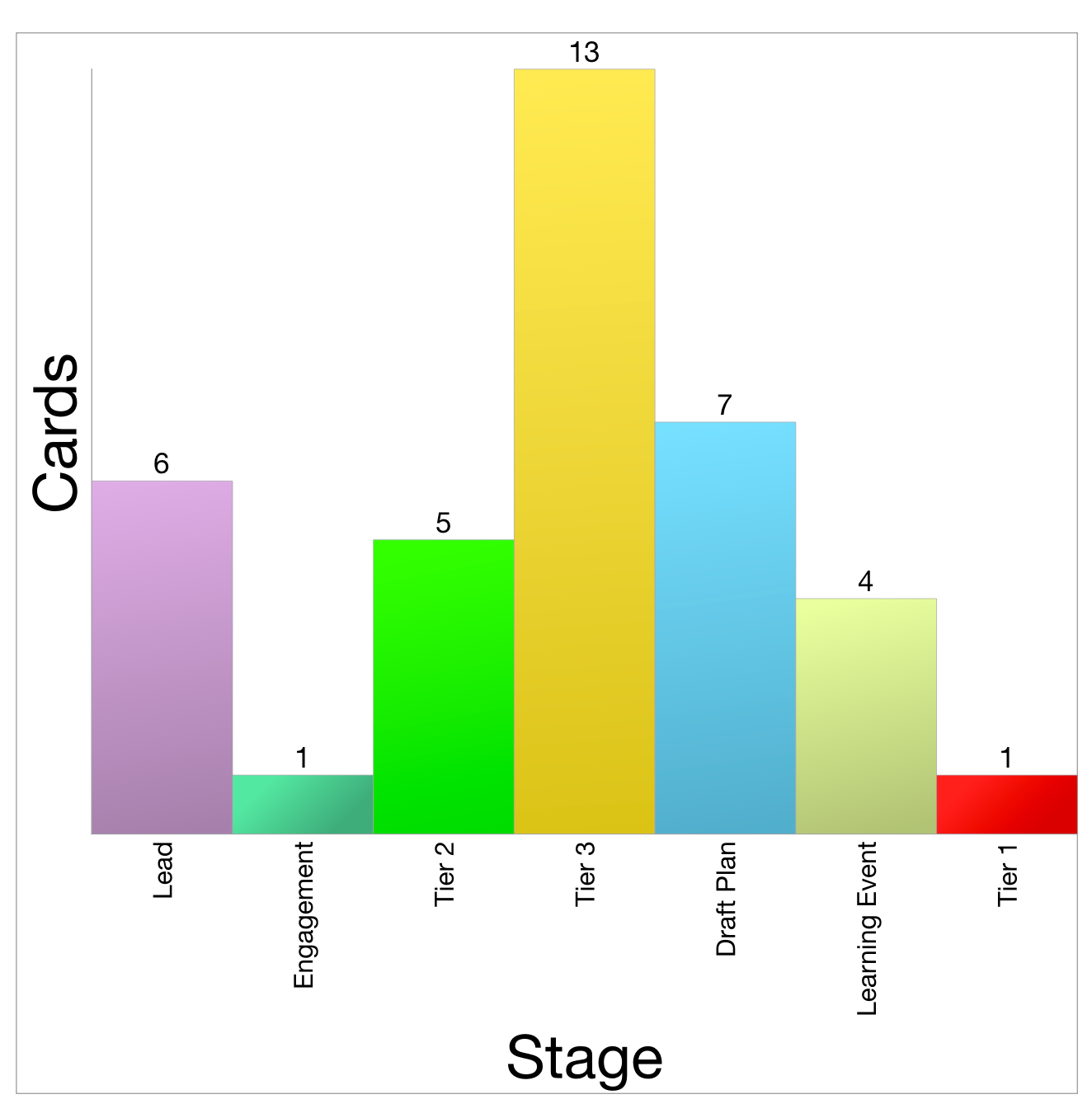 HyperPlan Chart counting categories
I remain a fan of locally-installed software, over web applications that run in a browser. That probably positions me firmly in the ‘old man’ camp. I don’t care. I like leveraging the power of multicore processors running at multiple Gigahertz. I like the app being in its own container - not a browser. So I commend HyperPlan for being a local app.
Unfortunately, for this Mac user, it’s not quite a native app. There are some giveaways in the user interface and user experience that betray its development with a cross-platform environment. It’s still better than Electron apps, though. These criticisms are little quibbles, like the text alignment of labels not quite matching with the interface controls, and some non-native iconography.
I’ve reached out to the developer, Andy Brice, about these, and he has been extremely responsive. Buying this software also supports a nice person like this. That’s nicer than paying money to a corporate behemoth, or underwriting a valuation for some venture capitalist.
Ultimately, HyperPlan is fun to use. It’s joyful to see cards whizz around the screen as the pivot parameters are changed. It provides a great visual insight into the dataset in use. I love it. I recommend it.
Friday, January 3, 2020
Agenda and NotePlan: two apps that ostensibly do the same thing. They provide a method by which to take notes with regard to meetings, projects and daily happenings.
Both apps have been carefully designed but have ended up operating quite differently to one another. Agenda feels practically overwrought. It feels slow in operation, fiddly with a range of sliding panes, non-standard drop-down menus and a hybrid rich-text/markdown environment. Everything that is put into the app is tied up into its proprietary datastore.
In use, I often feel as thought I’m fighting against Agenda’s design. Yet it has the killer feature of being able to link together meetings in a continuous timeline.
Additionally, it allows me to attach files, take photos and create a rich tapestry of notes in relation to a project. The only problem is that because the note-taking itself is so obtuse, many of my notes say something like “refer to notes taken in OmniOutliner”. Not great.
NotePlan feels lightweight. It feels like I’m writing in a straight-forward text field that supports markdown. In essence, behind the scenes this is what is happening. NotePlan creates a .md text file for each day that a note is created and stores it in the file system. It supports tagging which is how project notes can be tied together with the support of a search filter.
I used NotePlan consistently for about 6 months, but realised that I wasn’t getting any benefit from the history of notes I had taken. Things were getting lost, rendering the whole use of the app almost pointless.
So I purchased Agenda and moved in. This does a better job of enabling the review of notes, but the friction associated with getting data in is the roadblock.
Both apps offer feature parity across macOS, iOS and iPadOS.
NotePlan is available via Setapp or as a standalone purchase. Agenda has a fair freemium/pseudo-subscription model whereby you keep forever the features the app has at that moment, plus anything added in the coming 12 months. If you want features beyond that, you pay once again.
It’s hard to say which is better. They are both great, and both infuriating. I’m currently in the Agenda camp, but only just. I continue to look over the parapets to see how the other is performing. I own both, so the barrier to entry is low. Switching costs associated with data migration is the major factor, and that is not much.
I cannot provide a recommendation to others, but I am interested in alternative views.
Thursday, January 2, 2020
At the beginning of 2020, an update on my current app toolbox. Of course, it is overflowing with too many tools. My ideal state would be to have one centralised repository for everything. Yet each app offers a different set of features and benefits, and scratch particular itches. So I think the unified data store remains off in the distance.
| Purpose | iOS Primary | iOS Secondary | macOS Primary | macOS Secondary | Best Cross Platform |
|---|---|---|---|---|---|
| Blot via Git | Drafts | 1Writer | iA Writer | Drafts | iA Writer |
| Micro.blog | Drafts | iA Writer | MarsEdit | Drafts | Drafts |
| Report Writing | Ulyssess | Word | Ulysses | Word | Ulysses |
| Meeting Notes | Goodnotes | OmniOutliner | Curio | Agenda | OmniOutliner |
| Daily Notes | Agenda | Goodnotes | Agenda | Agenda | |
| Zettelkasten | 1Writer | iA Writer | The Archive | DEVONthink | iA Writer |
| Tasks | OmniFocus | Goodnotes | OmniFocus | Curio | OmniFocus |
| Brainstorming | iThoughts | OmniOutliner | iThoughts | Curio | iThoughts |
Other alternatives available include:
Thursday, August 22, 2019
I have bought a license for MailMate - a mail application for the Mac. This cost me AU$84. Why pay that kind of money for a mail app, when Apple provide Mail for free, and I have access to a good web app for Fastmail and Outlook for work email?
I was happy to pay the money because MailMate is excellent artisanal software that offers unparalleled features and power. That money also goes straight to the single developer who has committed to this app for years.
If you are looking for beautiful software, MailMate is not for you. If you are looking for simple software, MailMate is not for you. If you are looking for a Markdown-aware, IMAP-compatible, smart rule-centric email powerhouse, MailMate is for you.
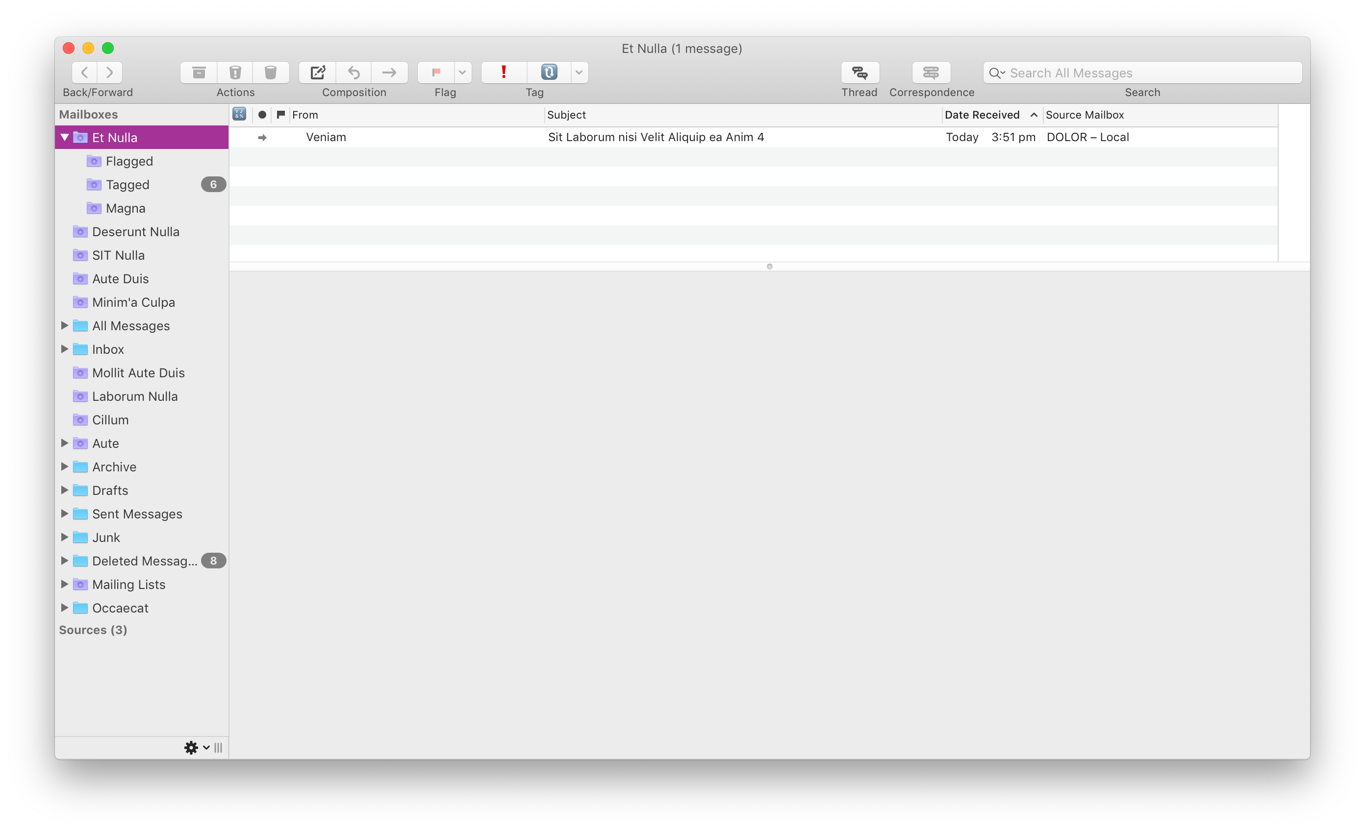 Functional - not pretty.
If you’re buying MailMate, you’re spending hard-earned dollars to get a mail app that does things that other mail apps do not. From my perspective, these are the features that I got for my money:
waiting for (🔃) and action (❗) tags that I apply to particular emails. Combining these with MailMate’s superpower - Smart Folders - unlocks further abilities.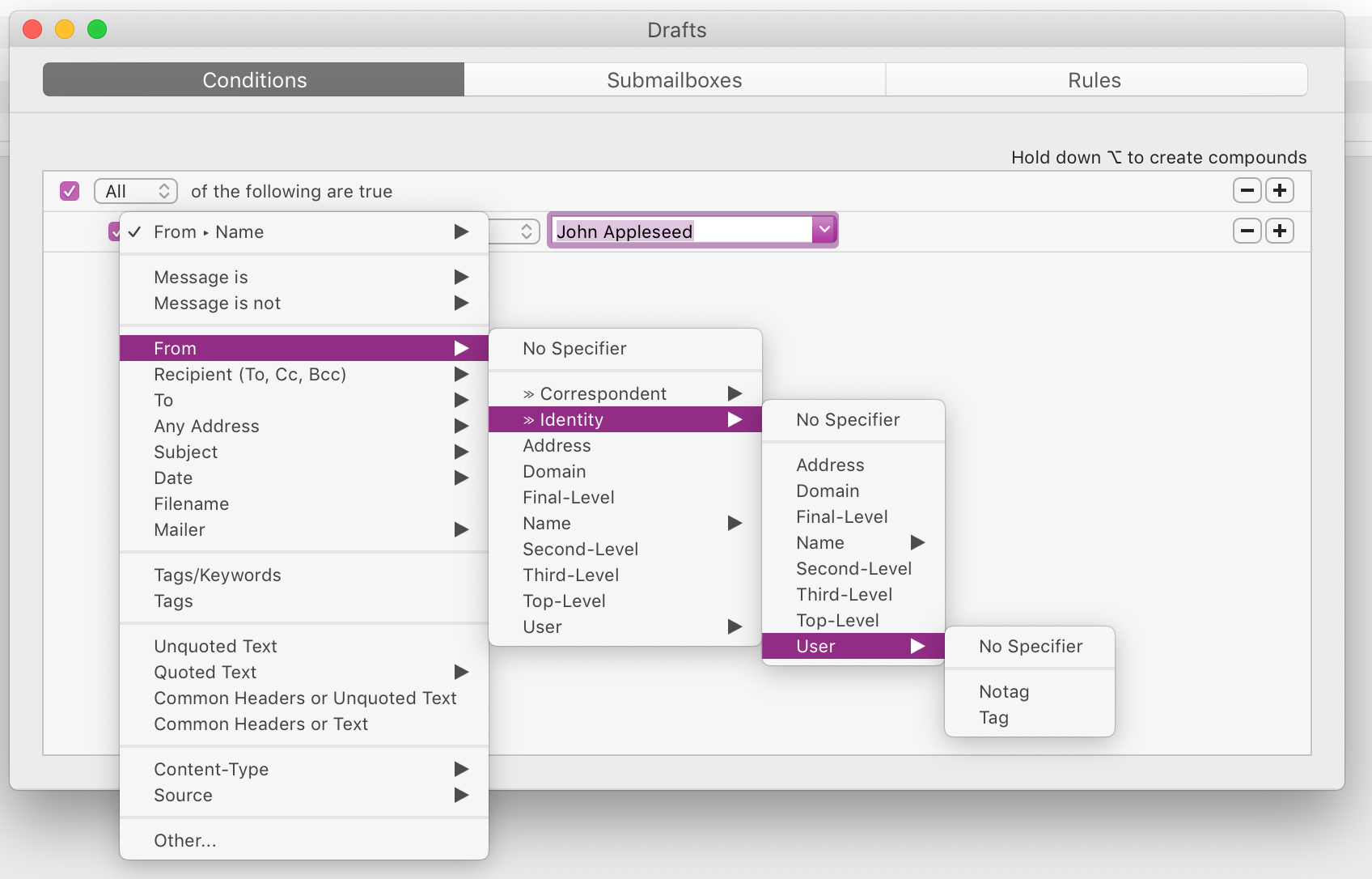 Filter to your heart’s content.
If you have a Gmail account and generally use the web app or your phone to deal with email, no, you shouldn’t buy MailMate.
If you have multiple email accounts1, and you want to centralise your email world into a single location and benefit from the features I outlined above, then yes, you should buy MailMate.
There are two brilliant reviews out there that provide alternative impressions of MailMate:
So, now you have three differing insights into MailMate, which may assist your decision-making process.
To use Exchange/Office 365 email, you need to be able to access it via IMAP. Check that your administrator hasn’t disabled it.↩︎
Sunday, June 16, 2019
The search for the right Mac Markdown editor is like a quest for the Holy Grail. There are many options, but finding the ideal fit is a challenge.
It got to the point where I had to do an audit of the options that exist on my computer, and consider which one might be best for my needs.
The list I came up with is, in potential order of preference:
A special mention:
I thought I would end up choosing BBEdit. That’s why I typed this post in the app. But in usage, I think the winner might be MultiMarkdown Composer.
Saturday, June 15, 2019
I’ve always had a version of BBEdit on my Mac. For a while it was TextWrangler, but now it’s back to BBEdit (unregistered). It’s one of those apps I don’t use very often, but when I want a pure Mac text editing experience, I know I can rely on it.
BBEdit can do a whole bunch of things that I don’t understand and have no need for.
But it is working very nicely as an integrated text editor for GitHub Desktop, and I feel like I might now benefit from the ‘unlocked’ version of BBEdit.
Friday, June 7, 2019
I’ve used Instapaper relatively consistently since Marco Arment introduced it. Was that a decade ago now?
Occasionally I’ve stopped using it, or toyed with other services like Pocket, or Safari’s Reading List feature. In the end, however, I’ve always gone back to Instapaper.
Despite that usage, I’ve never been interested in any of the service’s ‘power user’ features. They’ve always felt disjointed from my larger workflows. My Instapaper history is an island of data that is unconnected from my other information, which is primarily kept in DEVONthink.
At this point, I’m giving up on Instapaper. The finally nail in the coffin was the realisation of just how hard it was to get my data out of Instapaper. The RSS feed it provides is truncated, and links back to the Instapaper version and not the original article. So all my reading was excised from all my knowledge held in DEVONthink.
Fortunately, DEVONthink makes available a script that works in version 2.x (and not yet beta 3.0) that is able to create PDF versions of an Instapaper archive, using a CSV list of links available from Instapaper.
I was able to run this last night. It took about 3 hours to pull down over 2,000 articles. Now, these all exist within DEVONthink.
This experience has convinced me that I need a better way to manage my reading list such that I keep available my archive for more immediate use.
If this new process works, the benefits will be:
My new workflow is still a work-in-progress.
I am going back to basics and plan to use Safari’s in-built Reading List feature. This has the benefit of being universally available across all Apple platforms. This will serve as my queue. From there I can push articles deemed worthy of keeping to DEVONthink for long-term archival.
Safari’s Reading List, combined with its Reader view, should be sufficient enough for most purposes. It doesn’t work offline, which was a key feature of Instapaper… but let’s be realistic. When am I ever offline?
When importing to DEVONthink I will most likely save it as a clutter-free web archive or Markdown. I can do this using the share sheet on iOS and the DEVONthink clipper/share extension with macOS.
DEVONthink 3 (currently in beta) offers a simple ‘Reading List’ feature similar to Safari’s, but it seems a bit underwhelming at this stage. The iOS version is older and doesn’t have this feature at all. It is unlikely that I will adopt this element into my workflow at this time.
So, in summary, these are the workflow steps:
Monday, March 25, 2019
I’ve recently taken to using OmniOutliner as a daybook/Bullet Journal. I don’t actively follow the bullet journal methodology, although the more I think about it, the more useful it seems.1
Traditionally, I’ve not been one to record daily events as they occur and make notes about all the little things. More recently, however, I’m finding that I want to recall something that happened earlier, or a decision that was made, or an event. Whether this is memory loss caused by ageing, or wisdom gained through experience, I’m not sure. Whatever the reason, I know I want to keep some sort of minimal journal.
This journal needs to be separate and different from my task list. Nor do I want it to be my knowledge archive/zettelkasten. Those are different things that need different treatment. How I take care of those things is a story for another day.
I’ve owned copies of OmniOutliner Professional for the longest time but haven’t ever made full use of it. It has always presented itself as too fiddly. The fact that it’s not that great at exporting has been a problem as well, in that I put a bunch of stuff in, but have trouble exporting it to a format that works for others.
For this purpose, however, OmniOutliner seems very well suited. This data doesn’t need to go any further than me.
Steve Zeoli from Welcome to Sherwood was kind enough to kickstart my project by sending me a text file that has an outline of every day and date of the year. This was my starting point. Pasting this into OmniOutliner gave me a basic outline.
Now, within each day, I can nest commentary and notes. Just little tidbits and things I might need to know or refer back to. I can use it as a 43 Folders style bring-up system, nesting attachments or notes within the day they will be needed. I’ve done this with my tickets for EPW Goldrush2.
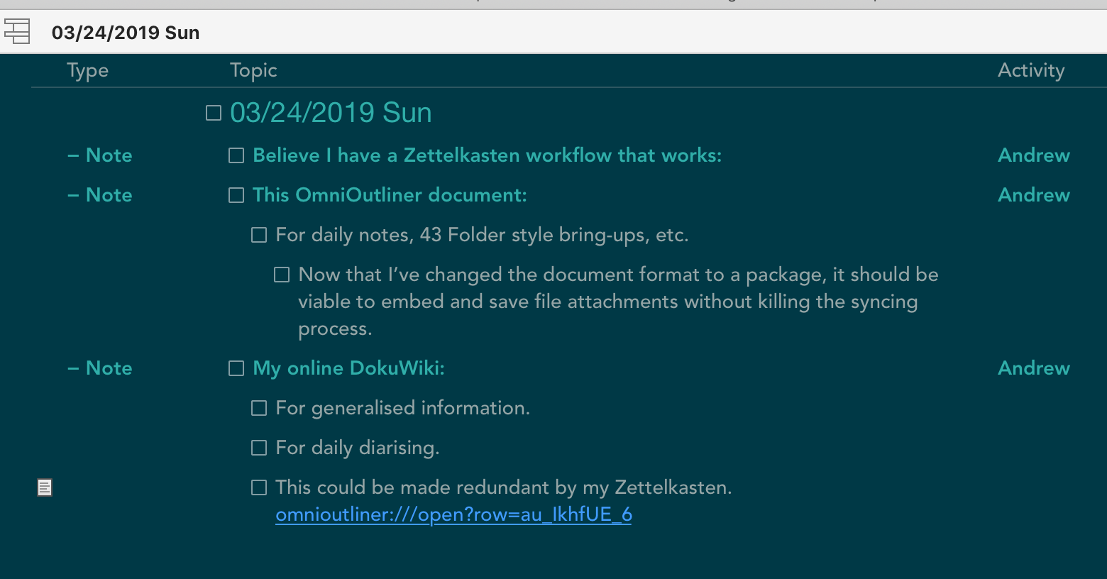 A sample entry from my OmniOutliner Daybook
OmniOutliner syncs across macOS and iOS using its own OmniPresence sync server. While I would prefer if it worked natively with iCloud Drive, in reality it doesn’t really matter.
OmniOutliner allows for multiple columns, so I have been able to create a few ‘metadata’ columns to support my notes. I’m still experimenting here, but at the time of writing, I’ve got pop-up selectors for Type (task, note, event), Activity (major project areas) and Context (action, waiting). While not wanting to replicate a task manager, having a few bits of extra data allows me to leverage the real power of OmniOutliner, which is filtering and focusing.
Using OmniOutliner, I can focus on just a single day, hiding all other 364 days. Or I can focus on the upcoming month. Or a selection of non-contiguous days.
Furthermore, I can filter based on the criteria of the columns. So if I just want to see the lines I have tagged the note to be an action, I can do that. Or I can combine the filtering and focusing to show me events in the next month. It’s all quite fun.
What’s more, all this filtering and focusing can be done on both platforms: iOS is an equal citizen with macOS.
If you are planning to keep a number of file attachments within your OmniOutliner document, and sync them efficiently, I highly recommend changing the default file save format. By default it saves as a ‘flat file’ which works better for non-OmniPresence syncing. But this means that each minor save results in the entire file - and attachments - being re-saved and re-synced. This is not very efficient.
Changing to the ‘bundle’ format allows the app to save using the macOS package file format. This then only syncs the changed elements, and leaves the various file attachments untouched and so they don’t sync each time.
There are plenty of options available to do a similar job, and I’ve tried them all!
With Steve’s date file, it was easy to try incorporating it into each application. They all have strengths and weaknesses, of course.
Some of these include:
I am sure my use of this daybook will ebb and flow, and I will probably change my approach as time goes on.
However, I can say that this system has made quick logging of events and noteworthy items doable through the day, and I believe I will get value back from it over time.
Wednesday, February 20, 2019
I have a tendency to suffer Imposter Syndrome.
At times when it strikes, it’s important to remember that while your own knowledge seems obvious, other people don’t share your brain. As such, sharing your information can deliver genuine insight and help.
This is why, in TheBrain, I keep these two nodes linked.
